The Story Behind Pro Eco Azuero's Logo: A Symbol of Passion and Conservation
- sandra8310
- Sep 10, 2024
- 3 min read

Logos have always been more than just a visual marker for organizations. I recently stumbled upon a LinkedIn post that reflected on the significance behind some of the most iconic logos—Apple, Coca-Cola, Airbnb, and McDonald’s—all of which carry deep meanings that resonate with millions. It got me thinking about our logo at Pro Eco Azuero, the one that has come to define our organization since its inception.
Our monkey logo is a reflection of the heart and soul poured into Pro Eco Azuero from day one. Edwina Von Gal, one of our founders, infused her passion and attention to detail into every aspect of the Azuero Earth Project when it first began. She knew how important it was to have a symbol that would carry the weight of our mission, and she worked with a renowned design agency in New York to bring it to life. The designer, Stefan, even won an award for his work on our logo, and I recently came across the explanation he sent Edwina all those years ago. His words struck a chord with me, and I want to share them with you:

"Dear Edwina,
Here is our design for your great project. We very much do hope it is to your liking.
A couple of thoughts about it:
All leaves and colors this monkey is made out of were taken from the Smithsonian Institute Herbarium image database. I don’t think it needs mentioning, — they represent biodiversity, and the variety of life in all its shapes, levels, and combinations; — all of these species are part of the overarching structure which defines the biosystem of Azuero.
The monkey silhouette is depicting a spider monkey (subspecies: Azuero spider monkey). Its form is distinctive and very unique which makes the logo recognizable; its thin limbs and posture refer to the fragility of the ecological system the Azuero Earth Project aims to sustain; this effect is emphasized by the leaf pattern structure."
Reading that explanation years later, it all clicked. Edwina has spoken about how, when she started the Azuero Earth Project, she understood that we needed a symbol people could relate to. And nothing connects people to nature quite like animals. While trees and plants are also vital, animals, like the Azuero spider monkey, evoke a different kind of empathy. The image of this endangered monkey, whose survival is intertwined with the health of our ecosystem, became the face of our work.
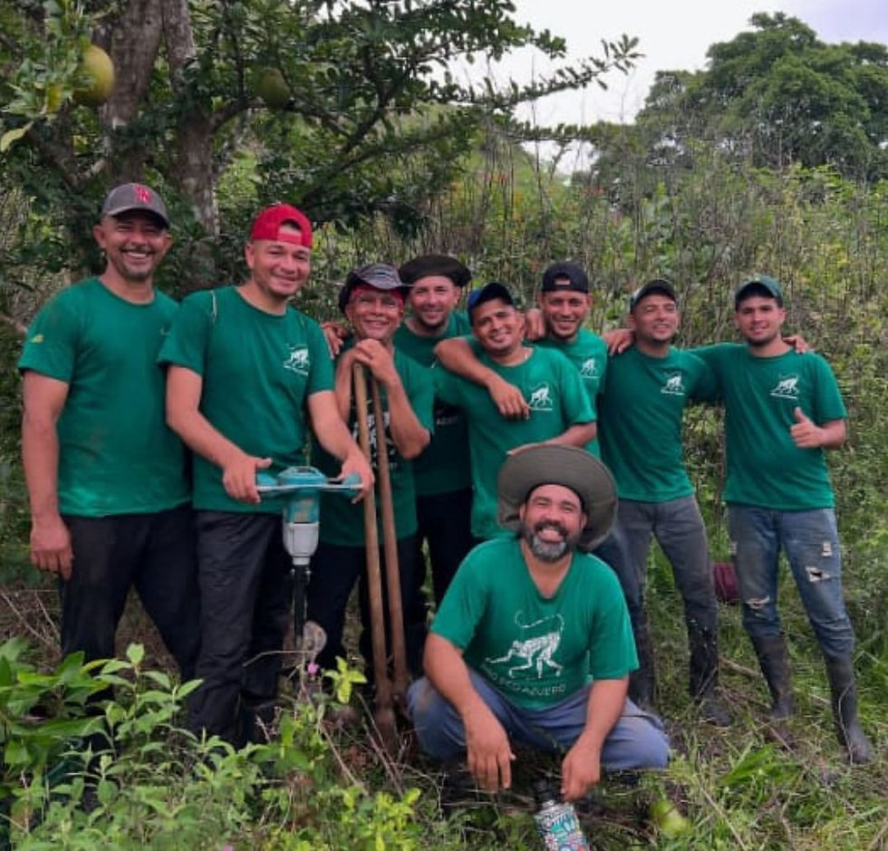
Years down the road, our communities in Azuero now identify us as the “Monkey People.” I even lovingly call our team the “Equipo Mono” (Monkey Team), and we are proud of that! Our logo isn’t just a design; it’s a symbol of the delicate balance we are working to protect, and it has perfectly complemented our conservation work throughout the years.
From the intricacy of its design, drawn from the very biodiversity we fight to preserve, to the recognizable silhouette of the Azuero spider monkey, this logo tells our story. It’s a story of passion, collaboration, and a deep-rooted connection to the land we protect. Every time we see it, it reminds us of the fragility of this ecosystem and the importance of our work.
And just like Edwina knew from the beginning, people are drawn to it—not just because it’s a beautiful logo, but because it represents something much bigger: a mission to preserve life in all its forms.
So next time you see our logo, remember, it’s more than just a monkey—it’s the embodiment of everything we stand for at Pro Eco Azuero. By: Sandra Vásquez, Executive Director Pro Eco Azuero


The Inline font has a sleek, modern look that works great for headlines and display text. I used inline fonts for a tech startup’s branding materials, and it immediately gave the design a futuristic edge. The hollowed-out style is eye-catching without being too flashy. If you want something that’s minimal but still impactful, this font is a solid pick.